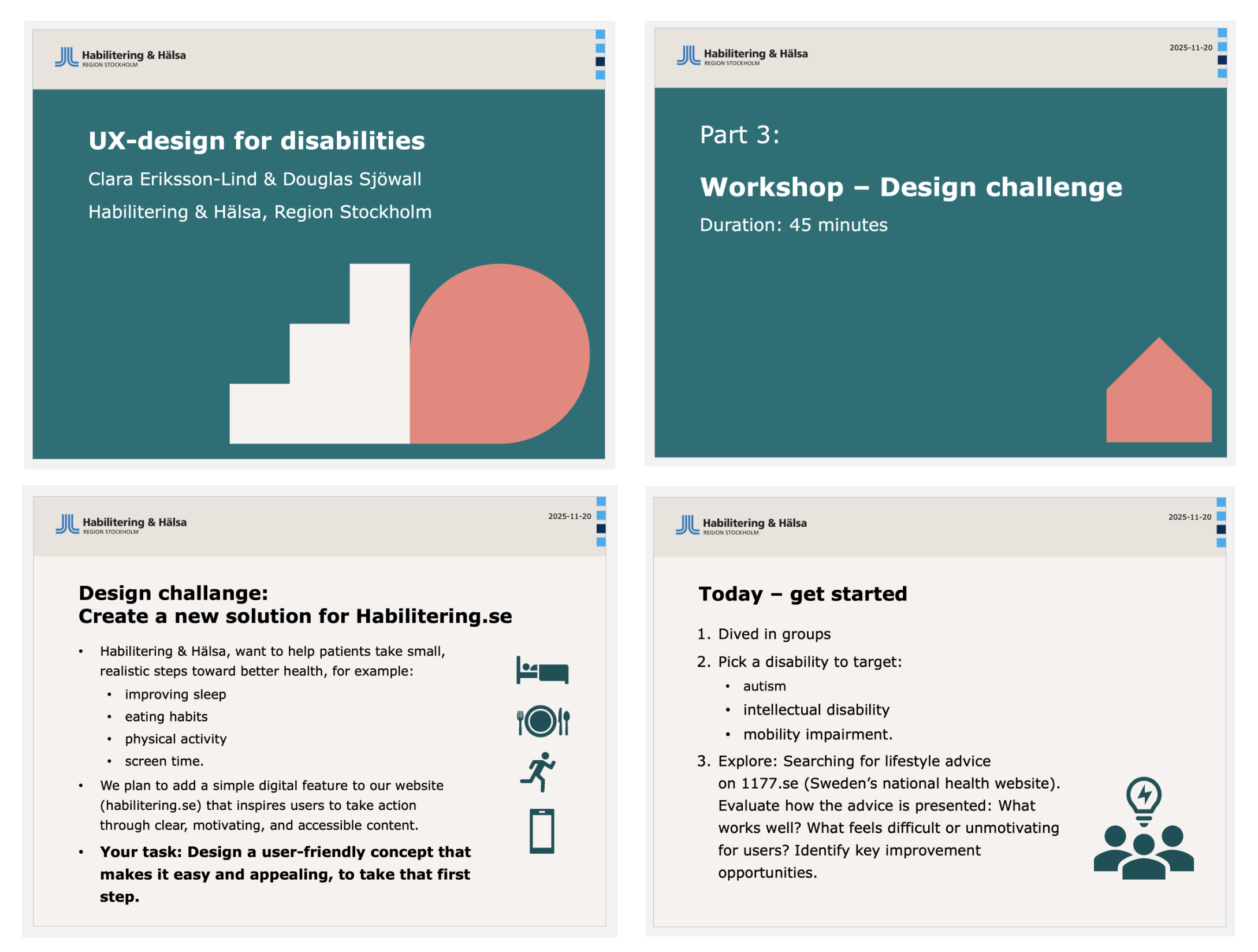
Context and Challenge
Habilitering & Hälsa in Stockholm provides support and services for individuals with developmental disabilities, including attention deficit hyperactivity disorder (ADHD). The challenge was to design a digital solution that can be implemented directly on their website.
Project Overview
One Tiny Widget is a micro-interaction concept exploring how a single, non-invasive yet persistent tool can reduce friction and cognitive load for users with ADHD.
Instead of full dashboards, menus or multi-step flows in a complete web app, the project investigates what happens when complex tasks surface through a minimal, always-available widget.
Core Problem
Users with ADHD often face unique challenges with digital interfaces. Too many entry points create decision paralysis, hidden functionality requires excessive memory load, mode switching fragments attention and high cognitive overhead makes even simple actions feel insurmountable.
Traditional productivity tools compound these issues by demanding engagement with entire systems, when the user simply wants to accomplish one small thing.

How small and simple can an interface be while still remaining useful, intelligible and respectful of the user's attention?
Design Journey
The brief
The project brief called for a digital health support tool within an existing website. Early group ideas followed familiar patterns: information hubs, guided questionnaires and structured task flows. In such cases, users would be engaging with multi-step interfaces in a stable, sustained way. This mismatch became the first design insight: the problem was not access to information, but the effort required to enter and stay within an interaction. Rather than designing for ideal attention, the challenge shifted early on toward designing for attention, interruption, hesitation and re-entry.
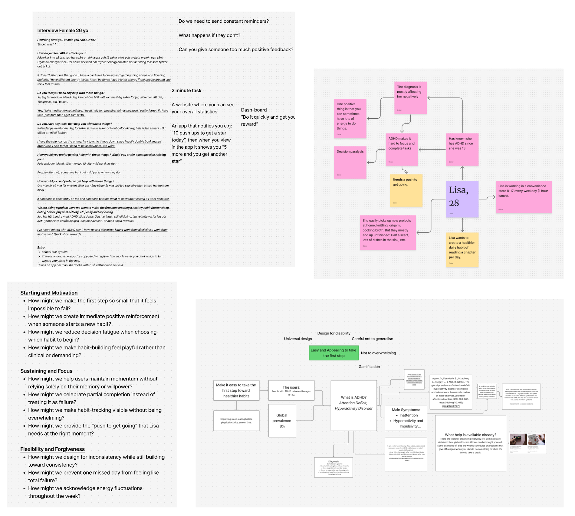
Understanding cognition in context
User research and synthesis focused on how attention is managed in real situations. Interviews, mapping exercises and journey fragments highlighted a recurring pattern: difficulty initiating tasks was often more significant than completing them. In similar contexts and existing apps, users described cycles of hesitation, distraction and returning before meaningful action began. Support was not about delivering more guidance, but about lowering the threshold for engagement... Something the users could approach without preparation, leave without penalty and return to without friction.
Exploring interaction scale
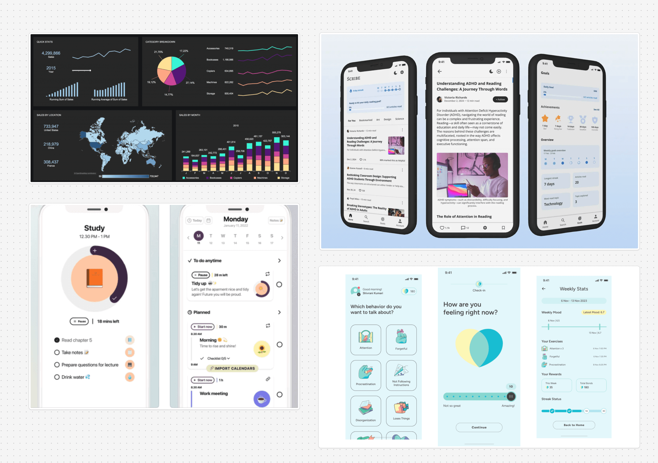
Further research and ideation produced a wide range of interfaces and possible scenarios. Concepts included dashboard-style overviews, sequential workflows, micro-prompts, minigames and persistent floating elements. But this rapid prototyping and research into existing solutions revealed a pattern. Larger interfaces with many options increased decision hesitation, while smaller entry points felt more approachable.
Reduce > Expand
The pivotal design decision was to move in the opposite direction from conventional productivity tools. Rather than offering more features, the concept narrowed toward a single persistent widget. This was supported by four theoretical perspectives. If people naturally seek the minimum viable action, the design should meet them there rather than force navigation through layers of functionality.
The emergence of "one tiny" as a design principle
The phrase "one tiny" from a user interview became a deliberate constraint. It did not just become a brand, but also a design principle applied across every interaction. If I could know that I could achieve one tiny thing... I would be interested to come back to it and stay engaged. Each tool was limited to one action, one thought, one break, following the humanistic HCI perspective. By choosing extreme minimalism, the attention support privileges micro-actions and pacing over throughput and optimisation. This was a conscious rejection of the usual productivity logic that dominates most task-management interfaces.
Iterating and complementary tools
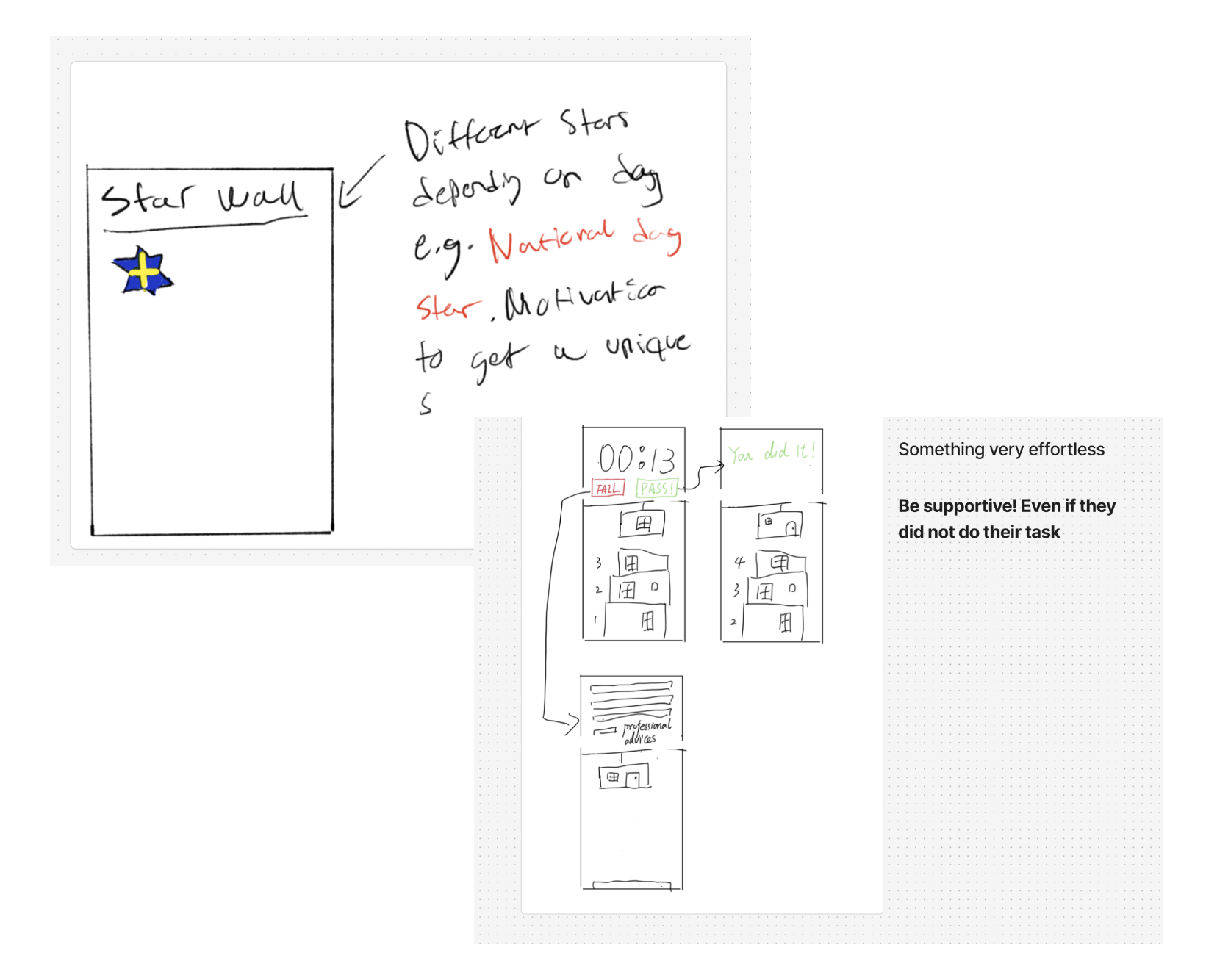
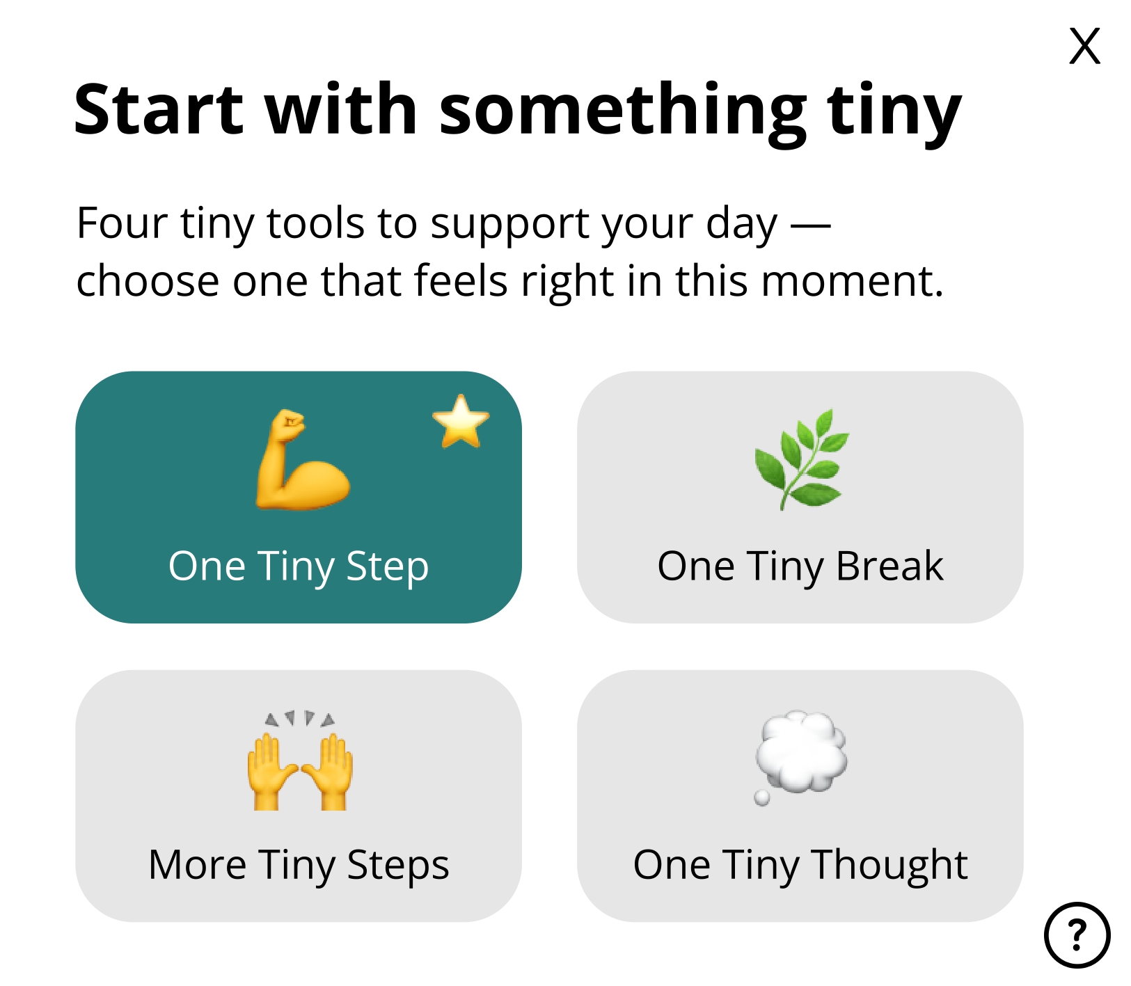
The widget began as a single interaction (One Tiny Step) and expanded into four tools only after reflecting on the range of states a user might be in: ready to act, needing structure, needing rest or needing to process a thought. Each addition was tested against the "one tiny" principle. Information seeking theory guided this: each tool represented a distinct entry point requiring no exploration or planning, supporting the users who will construct clarity eventually, rather than arriving with fixed goals. The home screen was designed last, deliberately presenting all four options as equally weighted to avoid imposing a hierarchy of "correct" usage.
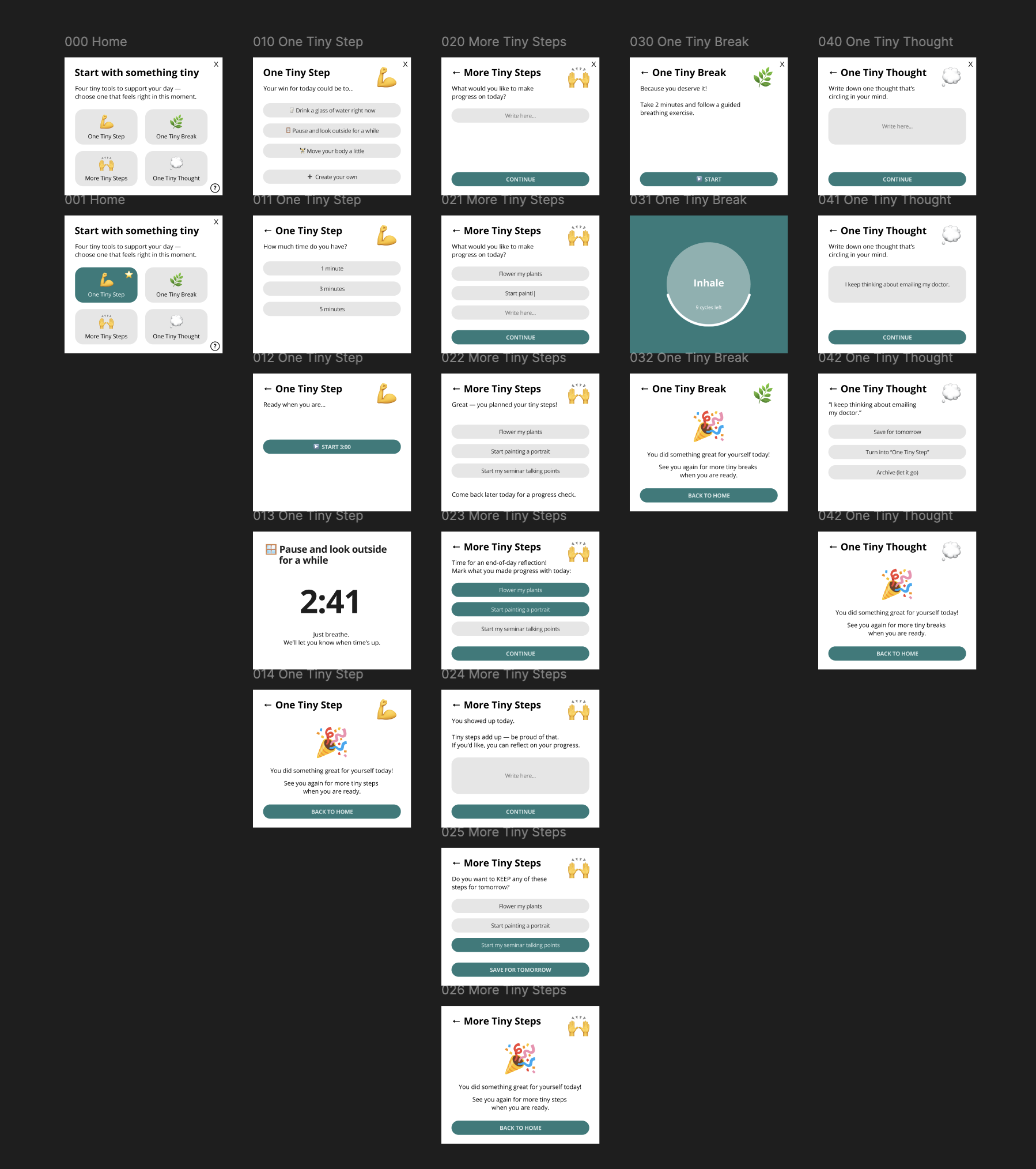
The First Interaction
Rather than presenting a home screen full of options, the widget intentionally begins with the simplest interaction: One Tiny Step.
Only after additional engagement can the users discover other useful functionalities.
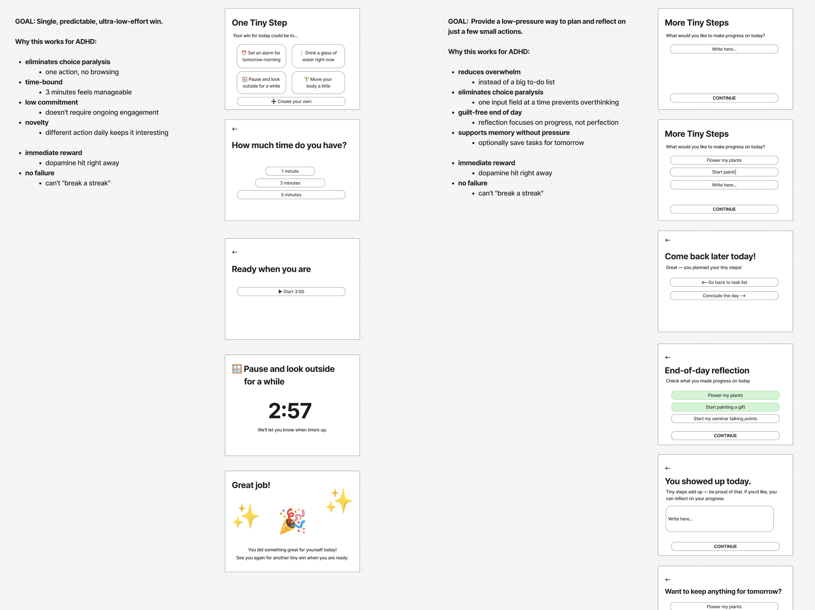
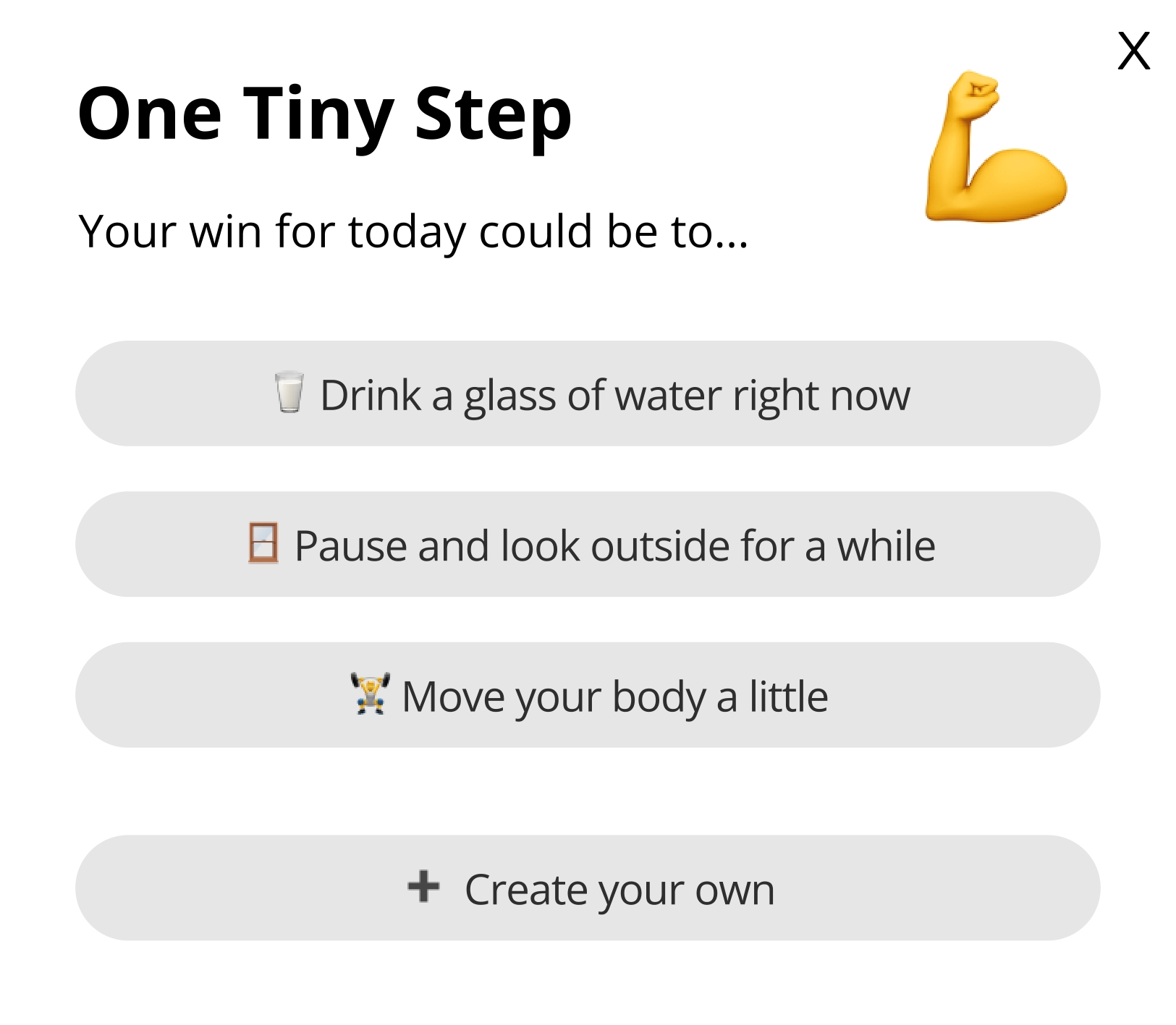
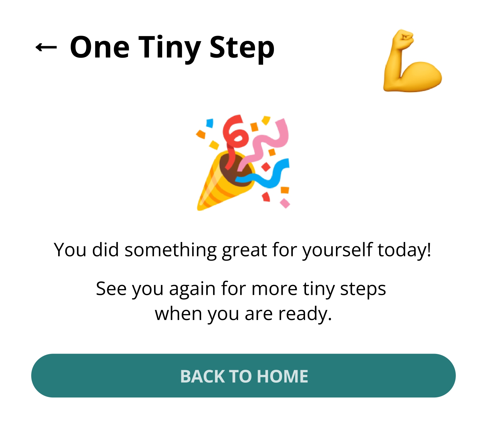
1. One Tiny Step 💪
Purpose
Enable a single, intentional micro-action through motivation.
Concept
The smallest meaningful interaction the widget supports. One action, one outcome.
Design Approach
Contemporary digital interfaces tend toward expansion – more features, more screens, more notifications. For users with ADHD, this accumulation is particularly harmful, creating environments where challenges are amplified rather than supported.
One Tiny Widget explores the opposite direction: what happens when we design for the absolute minimum viable interface?
For Habilitering & Hälsa, this offers a lightweight, embeddable solution that demonstrates their commitment to accessible design without requiring users to download or navigate complex apps.

Theoretical Foundations
The design of One Tiny Widget draws on four key theoretical perspectives:
Fluid assemblages
Redström and Wiltse describe digital artifacts as fluid assemblages: dynamically composed from hardware, software, networks, metadata and runtime behaviour, yet presenting stable surfaces to users. This tension between underlying complexity and experiential simplicity directly informed the widget's architecture.
One Tiny Widget proposes a deliberately constrained interaction surface. Behind the single screen lies a set of distinct functional states, contextual transitions and conditional logic, but the user encounters only one action at a time and is sometimes even asked to come back later. Such design foregrounds clarity and reduces cognitive load.
Redström, J., & Wiltse, H. (2019). Changing things: The future of objects in a digital world. Bloomsbury Visual Arts.
Information seeking theory
This theory describes how users begin uncertain and construct clarity through exploration. Rather than arriving with fully formed goals, users satisfice, follow low-effort cues and rely on sensemaking to gradually build understanding. Interfaces should reduce cognitive foraging cost and enable incremental exploration rather than forcing premature decisions.
This directly shaped the widget's interaction model. The home screen, presented after completing the first step, displays four equally weighted entry points without hierarchy or recommended paths. Each tool begins immediately with no configuration, reducing the foraging that typically prevents engagement. The widget also does not demand that users know what they need, it supports them in finding out as they go.
Morville, P. (2013). Information seeking. In Search patterns: Design for discovery (pp. 13–34). O’Reilly Media.
Living disability theory
Cognition is framed as situational and fluctuating rather than as a stable capacity that is either present or deficient. This perspective rejects productivity models that assume consistent attention and instead asks how design can respect variability.
One Tiny Widget is built on this premise. It does not assume a "good day" baseline nor does it treat inconsistency as failure. The widget is useful when capacity allows and imposes nothing when it does not. There are no streaks, no reminders, no accumulation of missed actions. Diagnostic framing is avoided entirely, never labelling the user's state, instead offering low-pressure, micro-scale interaction that meets people where they are.
Hofmann, M., Kasnitz, D., Mankoff, J., & Bennett, C. L. (2020). Living disability theory: Reflections on access, research and design. In Proceedings of the 22nd International ACM SIGACCESS Conference on Computers and Accessibility (ASSETS ’20) (pp. 1–13). Association for Computing Machinery.
Humanistic HCI
Every design choice embeds assumptions about what matters, what counts as success and how technology relates to human experience. This perspective asks designers to be explicit about the normative stances their work takes.
One Tiny Widget expresses a clear normative stance: humane attention support should privilege micro-actions, pacing and experiential clarity over productivity. The design is deliberately reflective, treating technology as embedded in lived cognitive practice. Completion messages like "You showed up today" value presence over output. The absence of metrics, progress bars and performance tracking is itself a design decision grounded in the humanistic commitment to treating users as whole people rather than as productivity units.
Bardzell, J., & Bardzell, S. (2015). Humanistic HCI. Morgan & Claypool Publishers.
Research and Insights
Lowering the threshold to begin.
The first interaction with the widget does not reveal all possible options. Instead, the user is invited to follow a simple healthy action or make up a custom one, reducing the effort compared to tools that require planning or understanding the system first.
Insight: Reducing upfront decisions can make starting feel more achievable.
Working with, not against, limited focus.
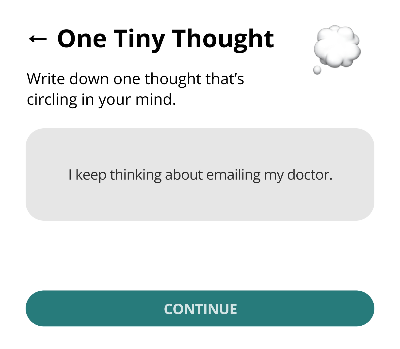
Each tool is constrained to one action at a time: one step, one break, one thought. For example, One Tiny Thought only allows writing down a single thought before asking what should happen next, preventing escalation into longer lists when undesirable.
Insight: Intentional limits can help prevent mental overload during interaction.
Action without streaks or commitment.
Unlike many productivity tools, actions in the widget end naturally. Finishing a timed step or break returns the user to a neutral confirmation state, without streaks, reminders or pressure to continue.
Insight: Short, self-contained interactions can reduce the feeling of obligation.
Supporting pauses and interruptions.
Stopping is treated as normal. Users can leave after any action and return later without reconfiguration or penalty. The system state remains simple and recognisable upon return.
Insight: Interfaces that assume frequent interruption should minimise the effort to resume.
Reflection without productivity framing.
End-of-day moments in More Tiny Steps and One Tiny Thought focus on acknowledgment rather than output (e.g. “You showed up today”). Reflection is optional and never framed as optimisation or performance.
Insight: Reflection can be supportive without being evaluative.
Supporting Tools = Full Experience
Beyond One Tiny Step, the widget includes three additional states that work together to support different moments in a user's day. Each maintains the same minimal philosophy while addressing distinct needs.

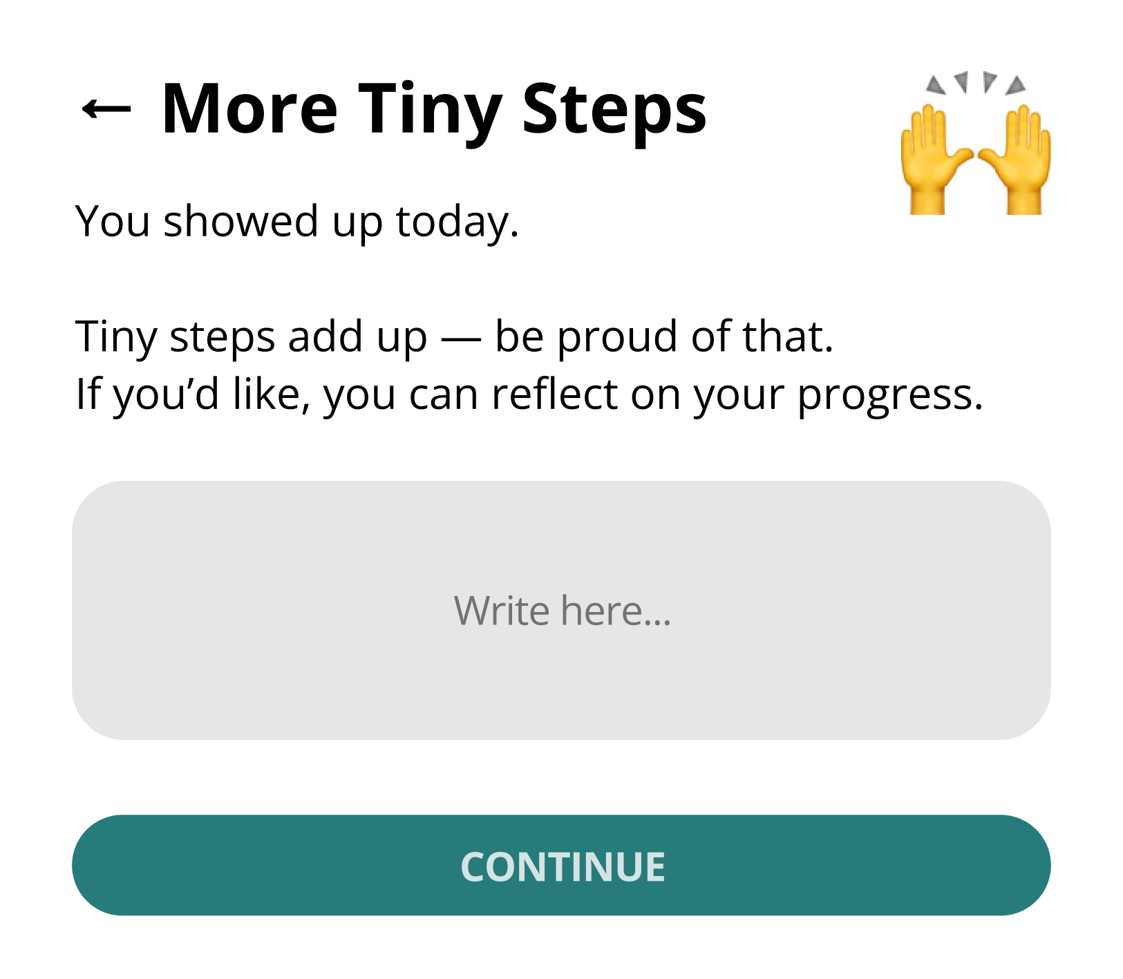
2. More Tiny Steps 🙌
Purpose
Support small progress without turning it into a larger commitment.
Concept
Users can note several small steps in one place and return to them later, without deadlines, prioritisation or restructuring. Progress is acknowledged, but the interface remains unchanged.
3. One Tiny Break 🌿
Purpose
Support stepping away without justification or follow-up.
Concept
A timed breathing exercise with no decisions to make and no actions to complete. When the break ends, the interaction ends with it.
4. One Tiny Thought 💭
Purpose
Create a space to dare to externalise a single recurring thought, with the goal of supporting decision-making.
Concept
The user writes down just one central thought. Afterward, three simple outcomes are offered, preventing accumulation and over-processing.
The Four Tiny Actions' Home
Purpose
Help the user orient themselves without requiring a predefined goal.
Concept
After their previous interaction with One Tiny Step, the home screen presents four equally weighted starting points. The user chooses based on their current state, rather than a plan.
Limitations and Critical Reflections
One Tiny Widget is intentionally constrained in scale, scope and ambition. While this restraint is central to the concept, it also defines clear limits to what the widget can support. Critically reflecting on these constraints and on the theoretical positions that motivate them is essential to understanding the strengths and blind spots.

Minimal Support as a Theoretical Choice
By design, the widget avoids structure, prioritisation and long-term planning. As a result, it is not well suited for tasks that require sustained coordination, complex dependencies or external accountability. The concept focuses on moments of engagement rather than ongoing management.
This means the widget can support starting, pausing and reflecting, but not organising or optimising larger bodies of work.
This constraint is not arbitrary. Disability theory frames this as a deliberate choice to respect the variability of lived experience: if cognitive capacity fluctuates, then tools that assume continuity risk excluding users at their most vulnerable moments. The widget's minimal scope is designed to remain accessible precisely when other tools become overwhelming.
Some of the Tiny "Constraints"...
- Only one focus at a time – no parallel or hierarchical task structures.
- No support for prioritisation of goals.
- No self-distinction between "important" and "unimportant" steps.
- No memory beyond simple carry-over (e.g. saving for tomorrow).
- No mechanism for obligation, deadlines or external commitments.
- No adaptation based on past behaviour or usage patterns.
These boundaries prevent the widget from growing into a system. However, they also mean that its usefulness depends heavily on the context in which it is used and the expectations users bring with them.
Conclusion
The One Tiny Widget assumes situations where users benefit from reduced choice, low commitment and lightweight interaction. In contexts that demand persistence, optimisation or external coordination, such restraint may feel insufficient or even limiting.
Therefore, it does not aim to replace existing tools.
Its value is situational: strongest when pressure, fatigue or uncertainty make larger systems difficult to engage with. The theoretical grounding in disability theory, humanistic HCI, information seeking and fluid assemblages provides a foundation for understanding not only why the design works the way it does, but also where its limits lie and what assumptions it asks users to accept.